
WATCH THE
PROCESS
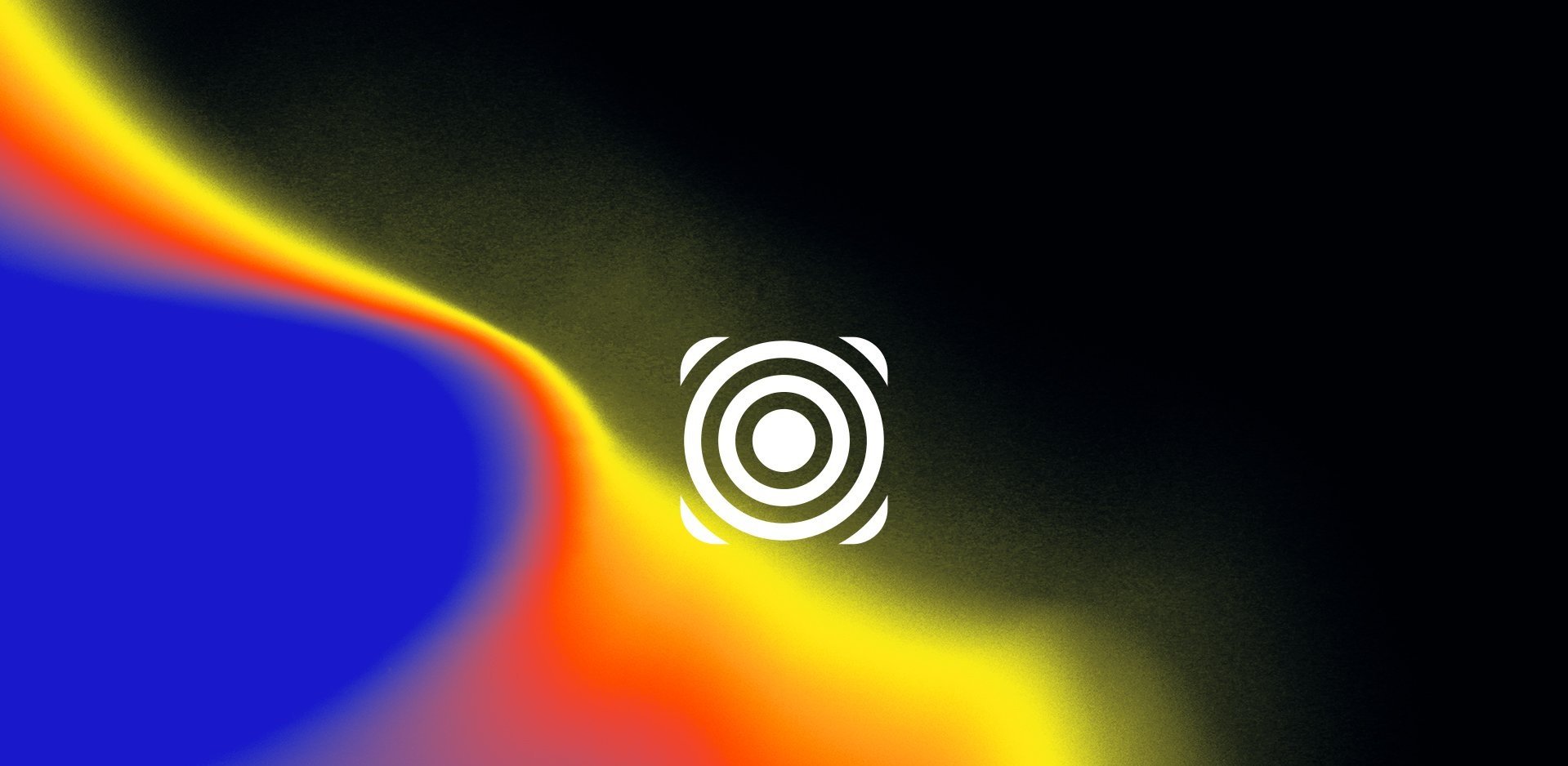
Logo, Print/Package
SERVICES
As someone who drinks more energy drinks than I probably should, I wanted to create one that I would want to drink. Most brands like Monster, Red Bull, and Nos are built around action sports, athletes, and adrenaline-fueled stunts. But what if an energy drink was made for creatives? As a creative who enjoys a caffeine rush and a good tasting drink, I figured there had to be others who would also enjoy a drink made for them.
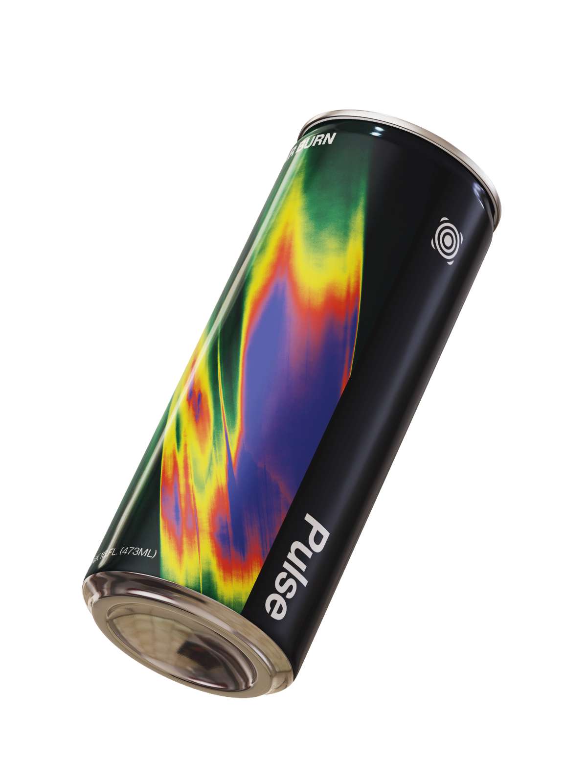
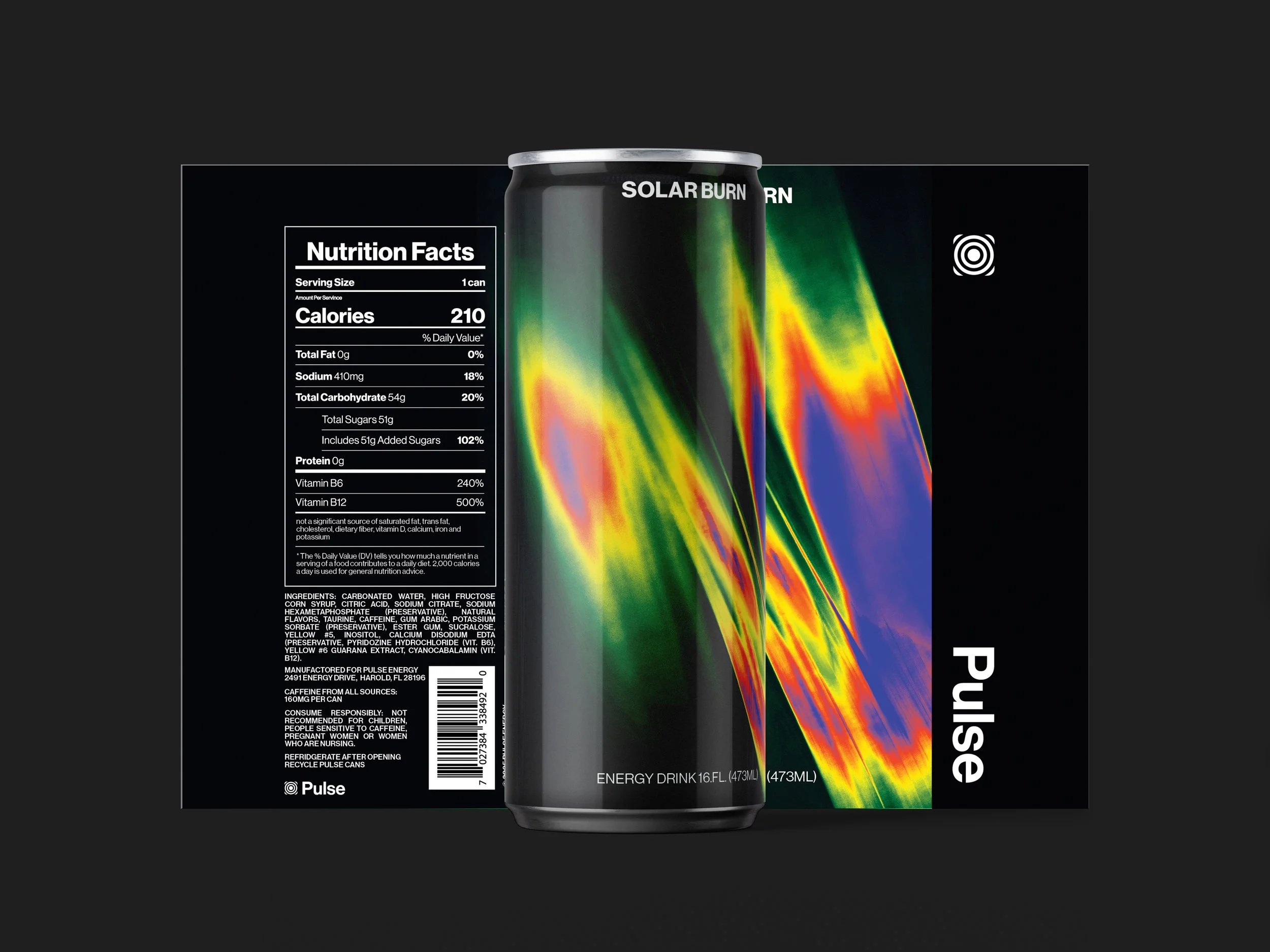
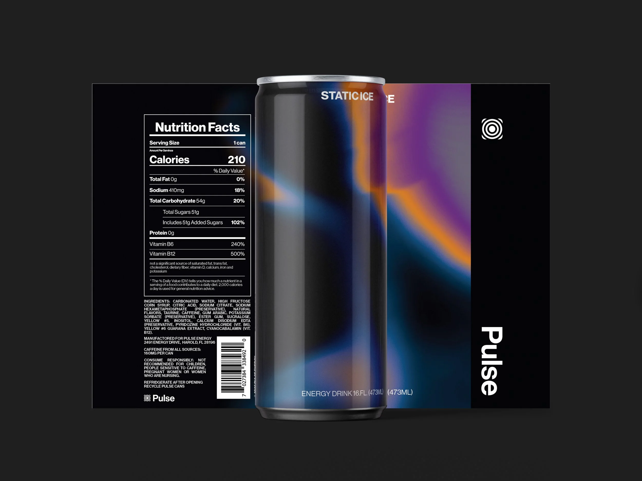
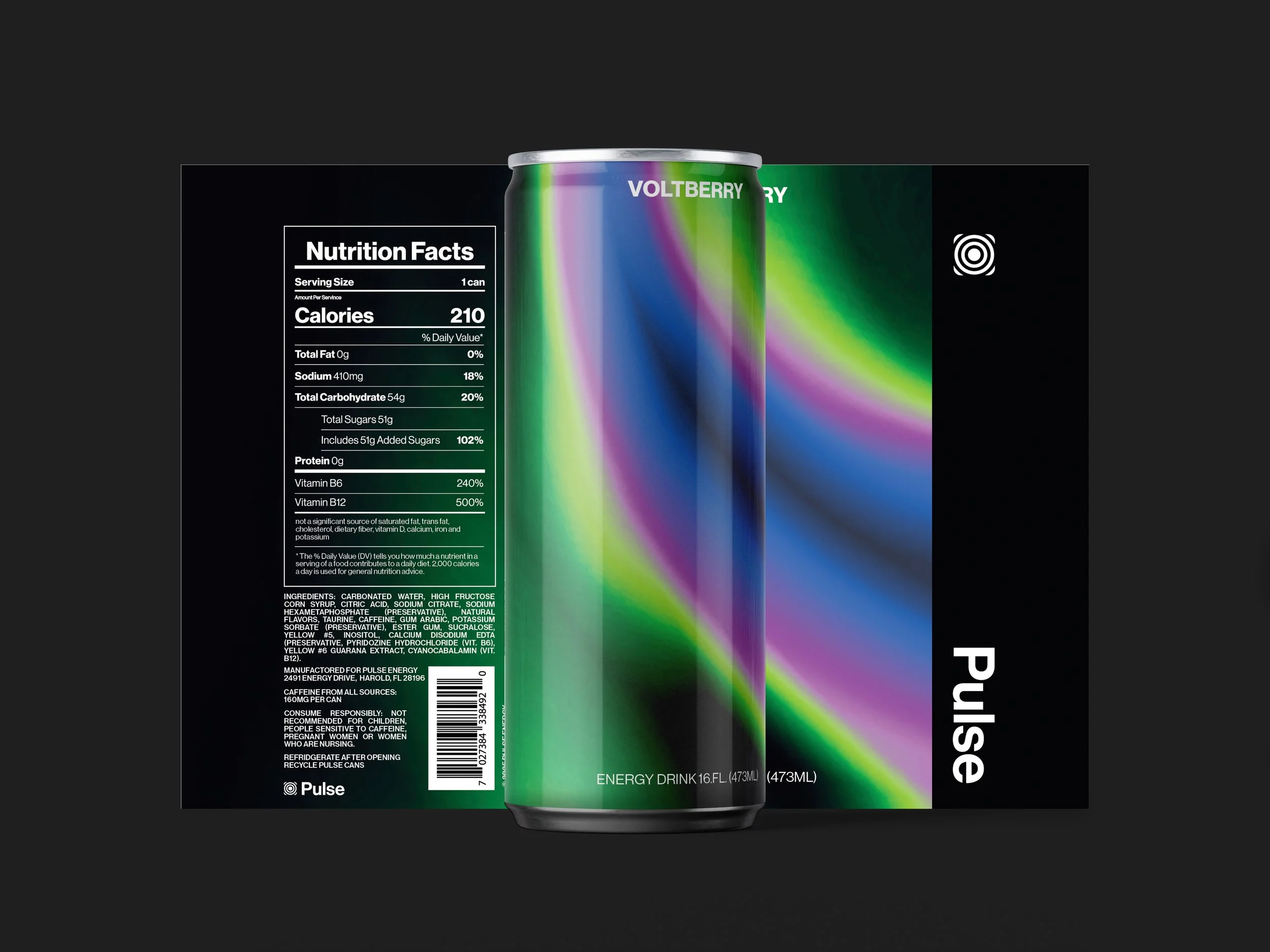
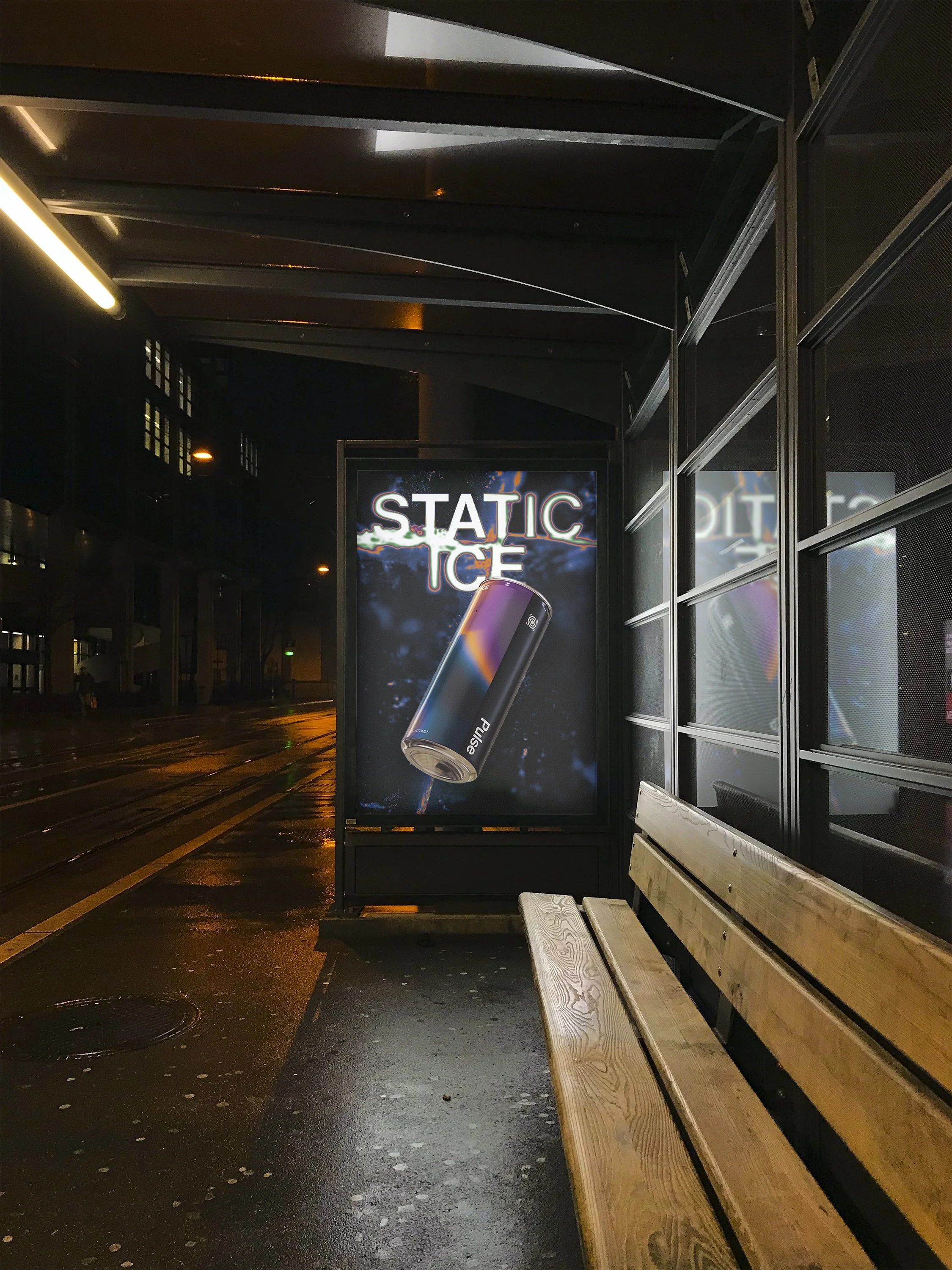
PULSE ENERGY DRINK
THE DESIGN
Visually, I wanted the can to reflect that creative spirit. It had to be bold and vibrant. I designed it with an eye toward catching attention on a shelf while still feeling grounded and intense. Since most energy drink buyers skew male, I leaned into a dark base, using black to anchor the design and give it weight while the colors give the design energy and help it stand out amongst competitors.


THE OUTCOME
Too often, brands make the mistake of letting their identity only say what they do. But when all your branding communicates is “energy drink,” it risks feeling shallow, forgettable, and generic. If you’re not telling people who you are and why you exist, then why would anyone choose you over established names like Monster or Red Bull?
That’s exactly what I wanted to avoid with Pulse. This isn’t just another energy drink. It’s a brand built to inspire. A spark for artists and creatives to make something bold, experimental, and completely out of this world.

CMMA Visual Identity
Visual Identity, Logo

Vans Better With Wear Campaign
Advertising/Marketing Campaign

Collect & Contrast Visual Identity
Visual Identity, Logo
