
WATCH THE
PROCESS
Visual Identity, Logo, Print & Brand Collateral, Merch, Motion Design (Designed by Clay Spahn)
SERVICES
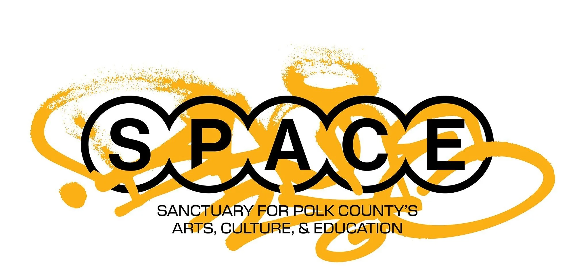
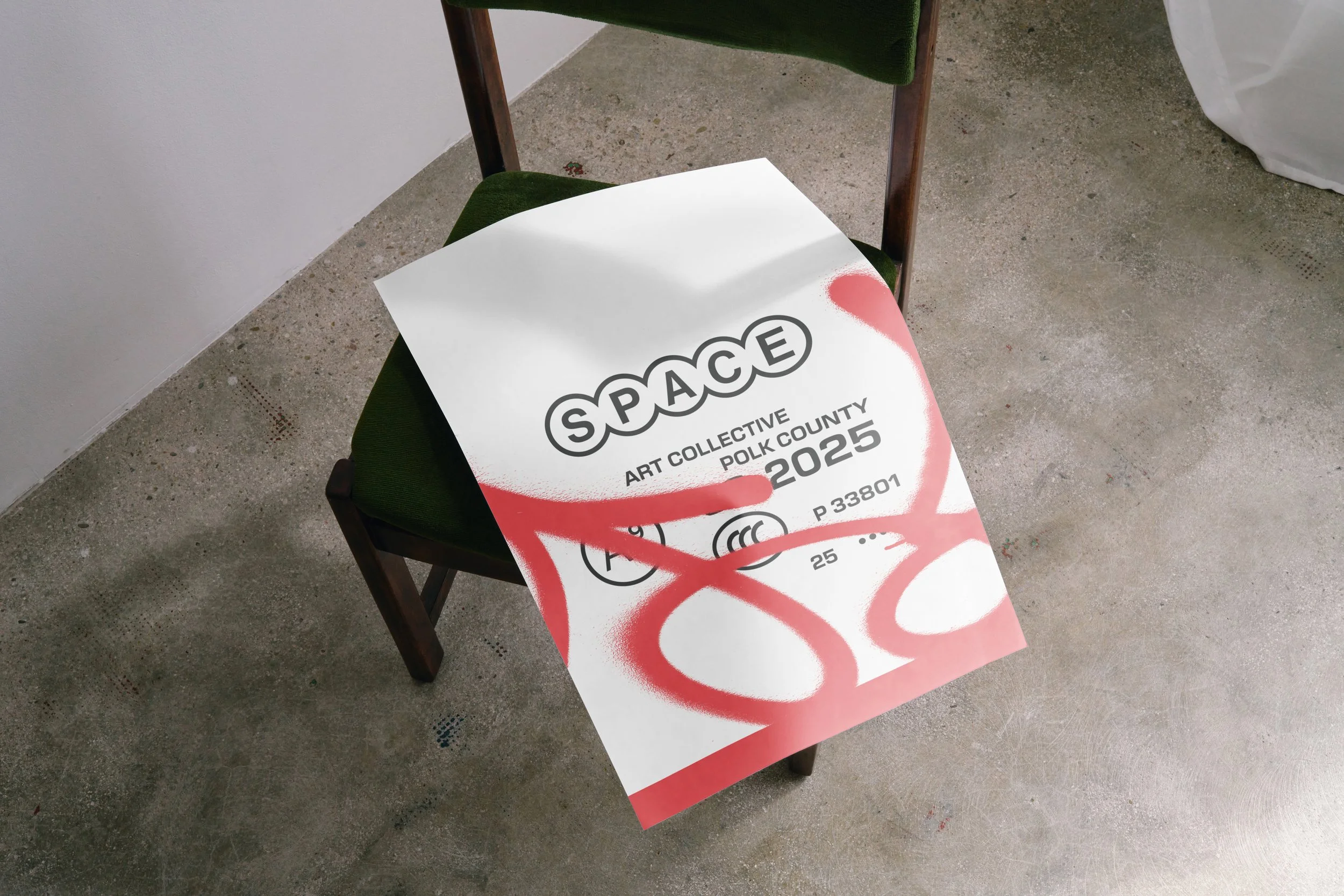
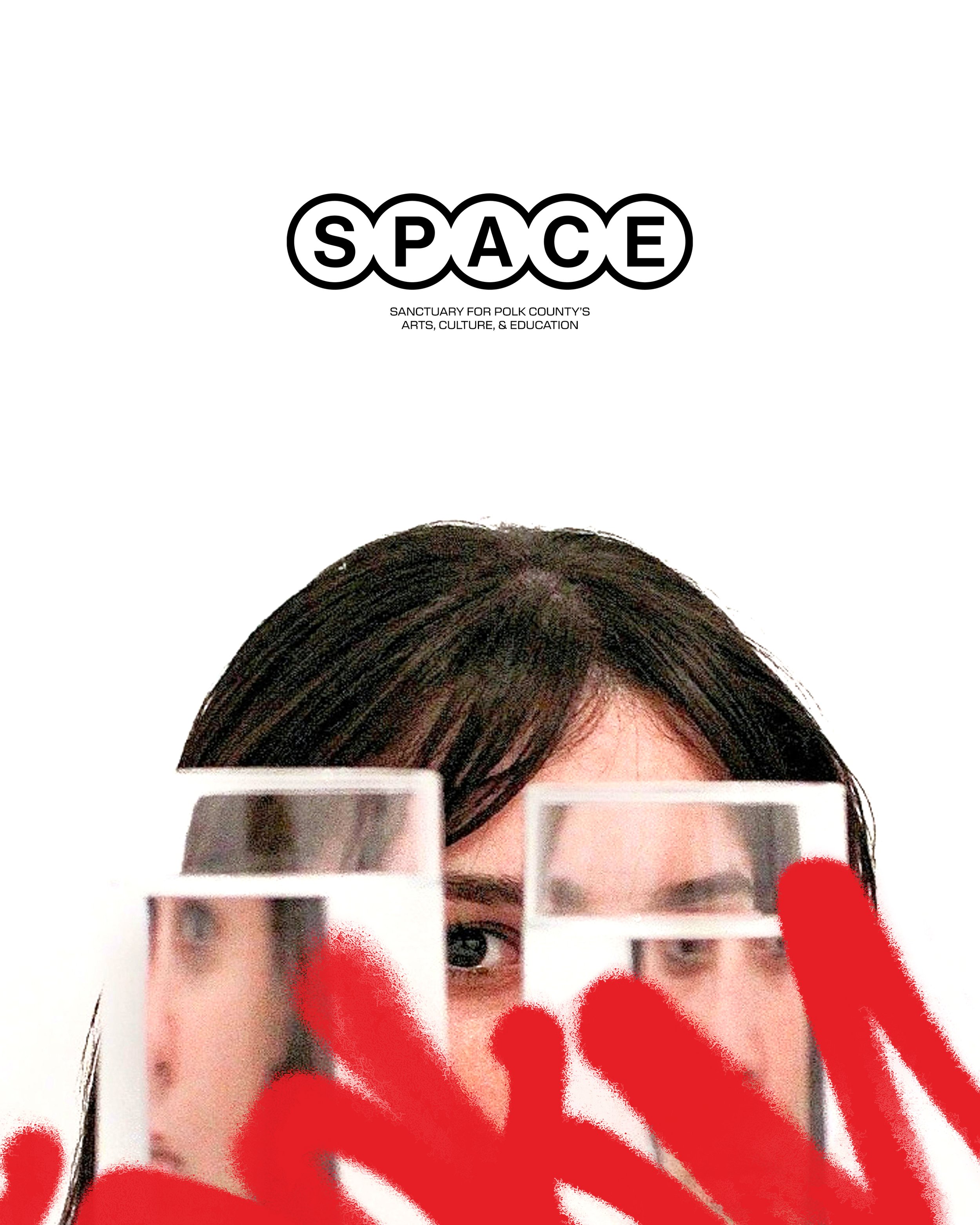
SPACE VISUAL IDENTITY
When I had the chance to create the visual identity for SPACE, the Sanctuary for Polk County’s Art, Culture, and Education, I was all in. This nonprofit aims to be more than just a location; it will be a hub where artists of all mediums, skill levels, and backgrounds can work, learn, and connect. The long-term goal is to open a brick and mortar space that fosters growth and community, and I’m personally invested in seeing the arts thrive here. I might not be able to fund the vision, but I can use my skills in design and branding to help launch it with impact.

SPACE aims to foster a thriving community for artists of all mediums, skill levels, and backgrounds. But before any of that could happen, they needed a clear and compelling visual identity. It had to communicate their mission, inspire local creatives, and grow with the organization. As a brand-new initiative with a passionate but nontraditional leadership team, SPACE needed help defining not just how it looked but what it stood for.

The next step was meeting with the team to help bring clarity and definition to the brand. Through a series of brand facilitation sessions, we worked together to define their mission, values, audience, and overall personality. These conversations weren’t just about visuals; they were about getting to the core of what SPACE is and what it hopes to become. This early collaboration laid the groundwork for everything that followed and gave us a solid foundation to build a visual identity with purpose and direction.
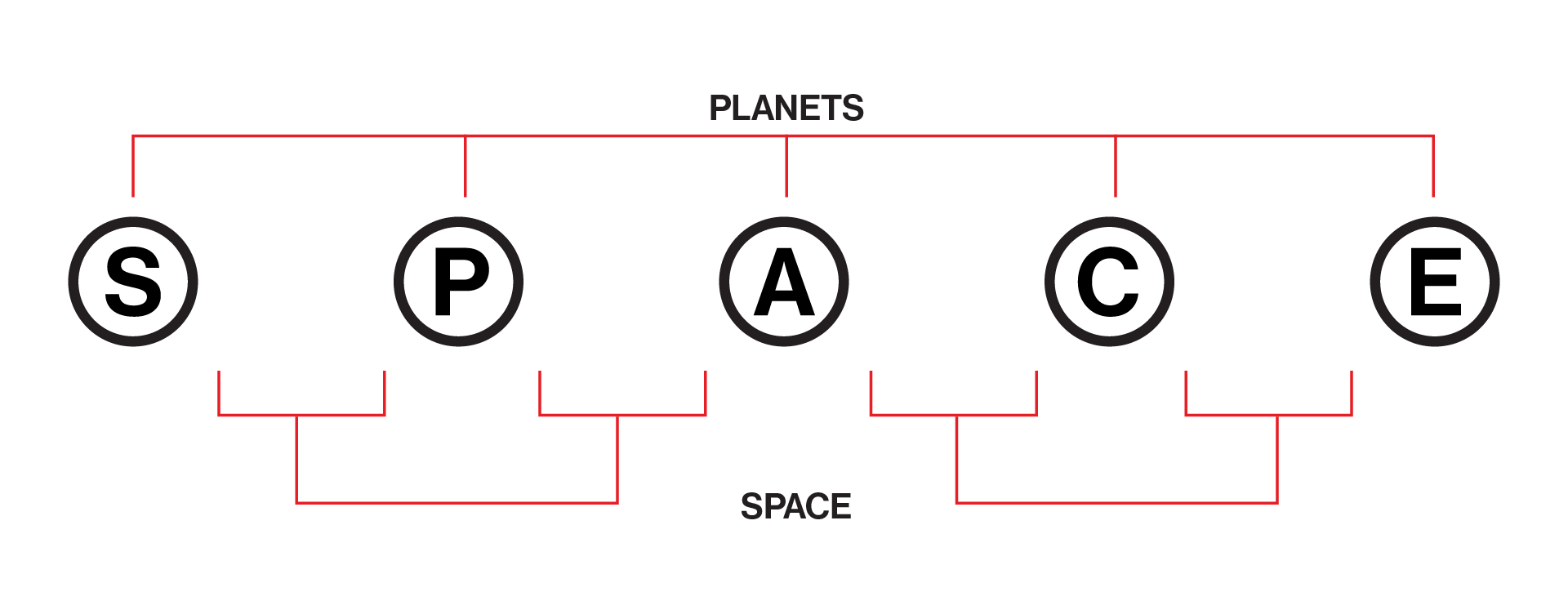
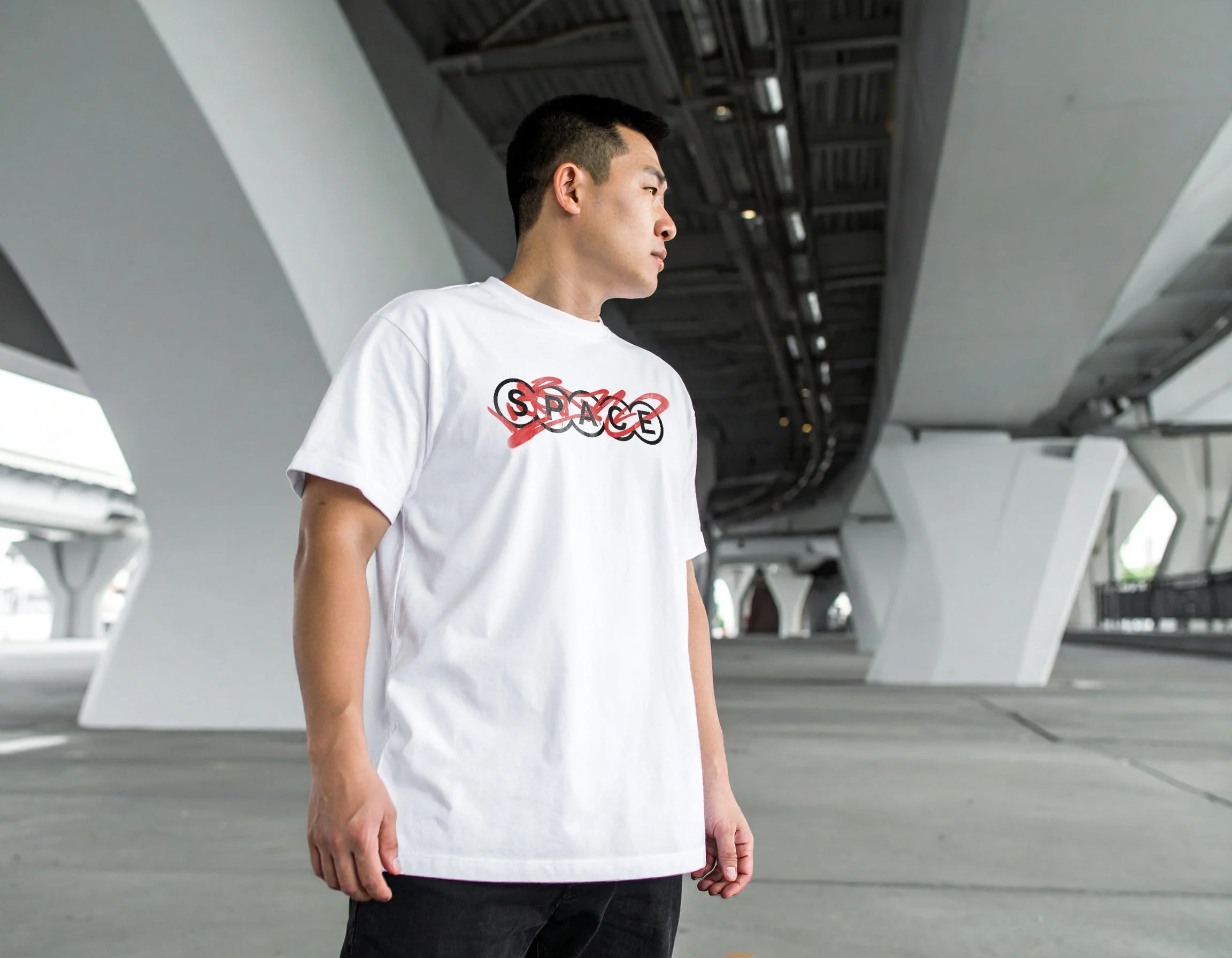
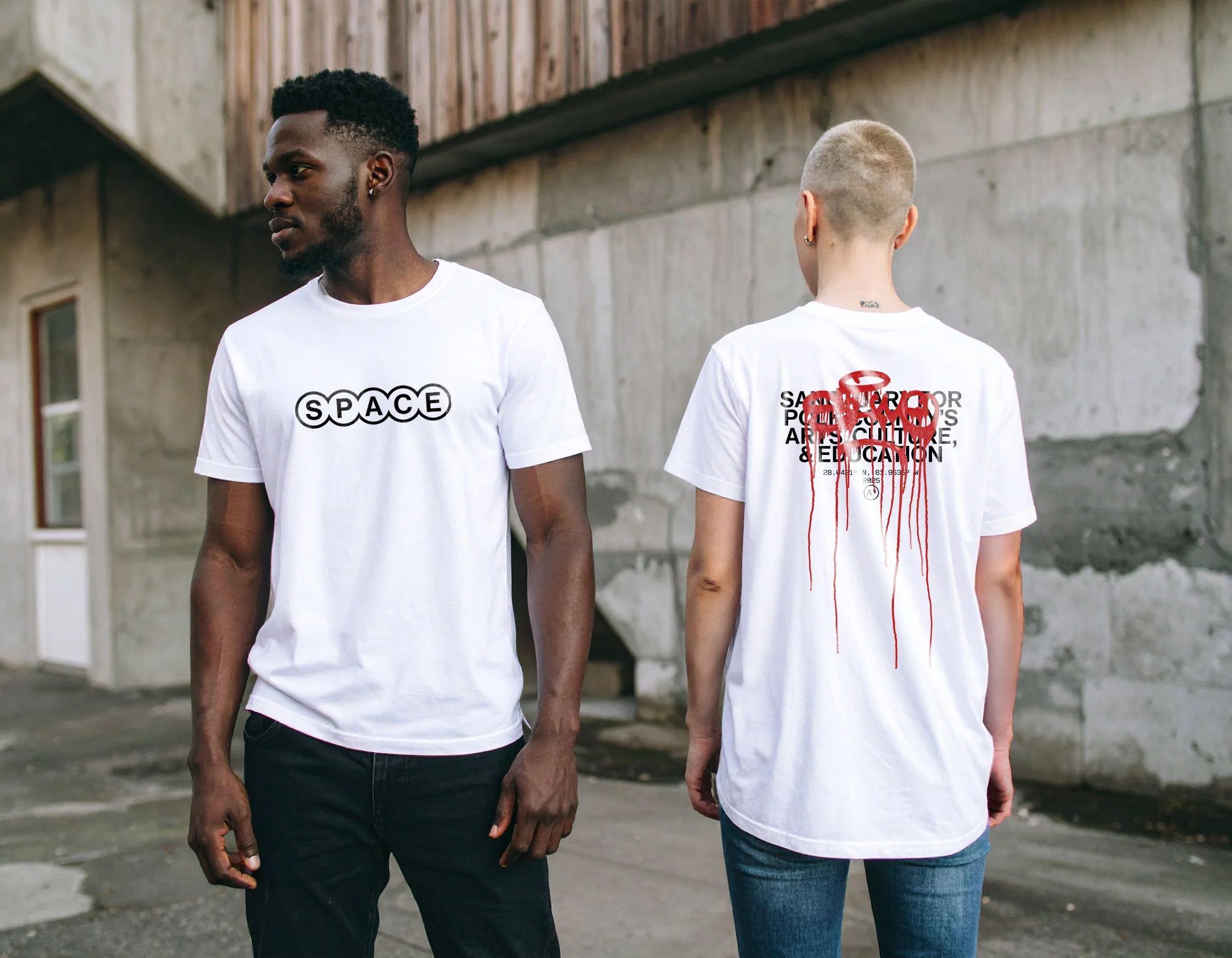
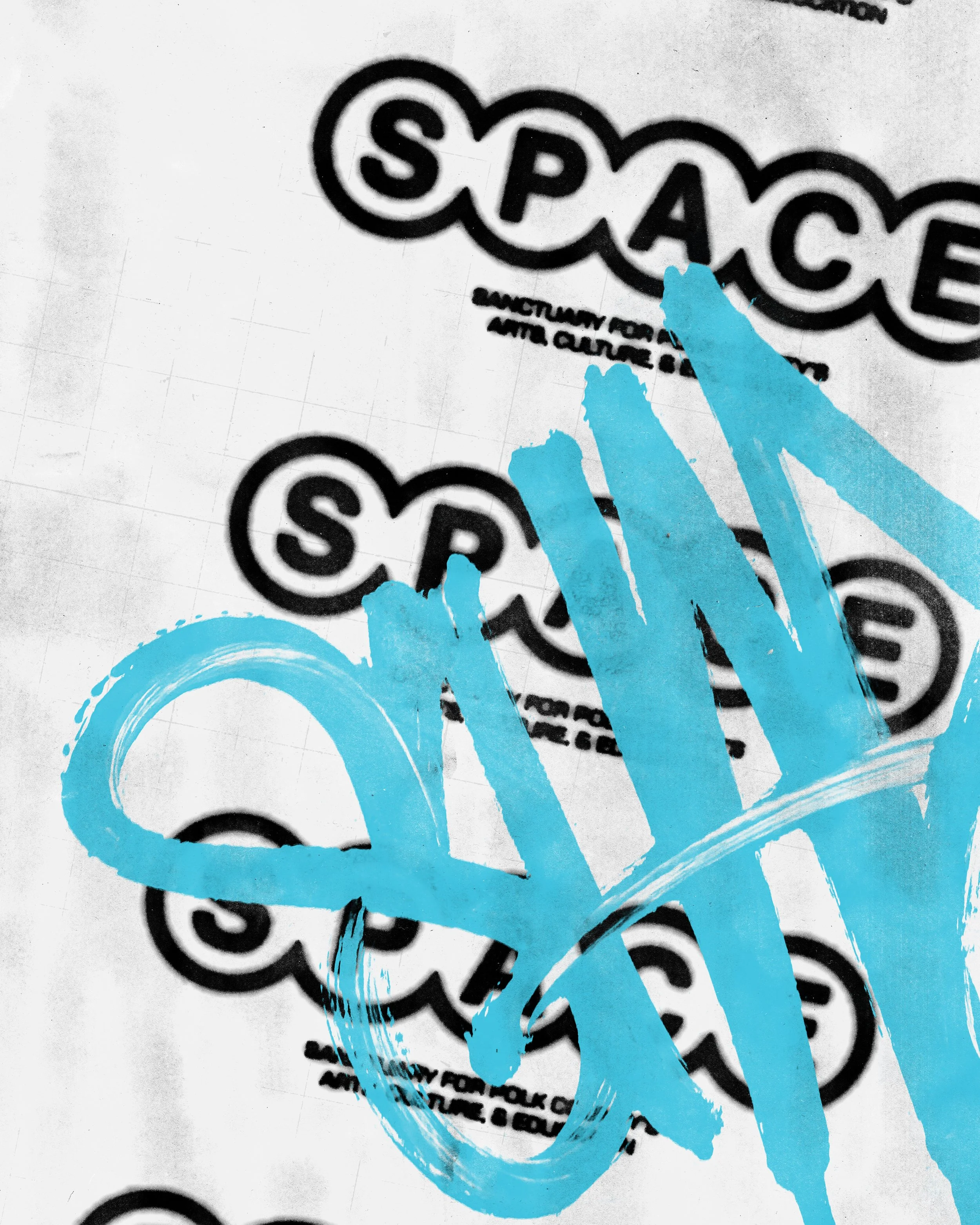
Once we settled on the visual direction with the stylescape, I dove into the logo design. I think conceptually when I create logos, trying to bring the brand’s values into something that feels alive, not static. The idea that stuck with me was simple but powerful: space is the area between two objects. That definition resonated because SPACE is all about community and inclusivity. You need more than one person to create that space. So I focused on playing with the spacing between the letters, literally pushing them apart to create more room.
Then, I had the spark to bring in the cosmic angle, imagining each letter surrounded by a circle, like planets in orbit. This blend of the conceptual and the cosmic perfectly captures what SPACE is about. The logo can spread out or come together, fit inside a circle or stretch across a layout, making it adaptable for many uses. It’s not just a mark; it’s an idea that reflects the creativity and spirit at the heart of the brand.


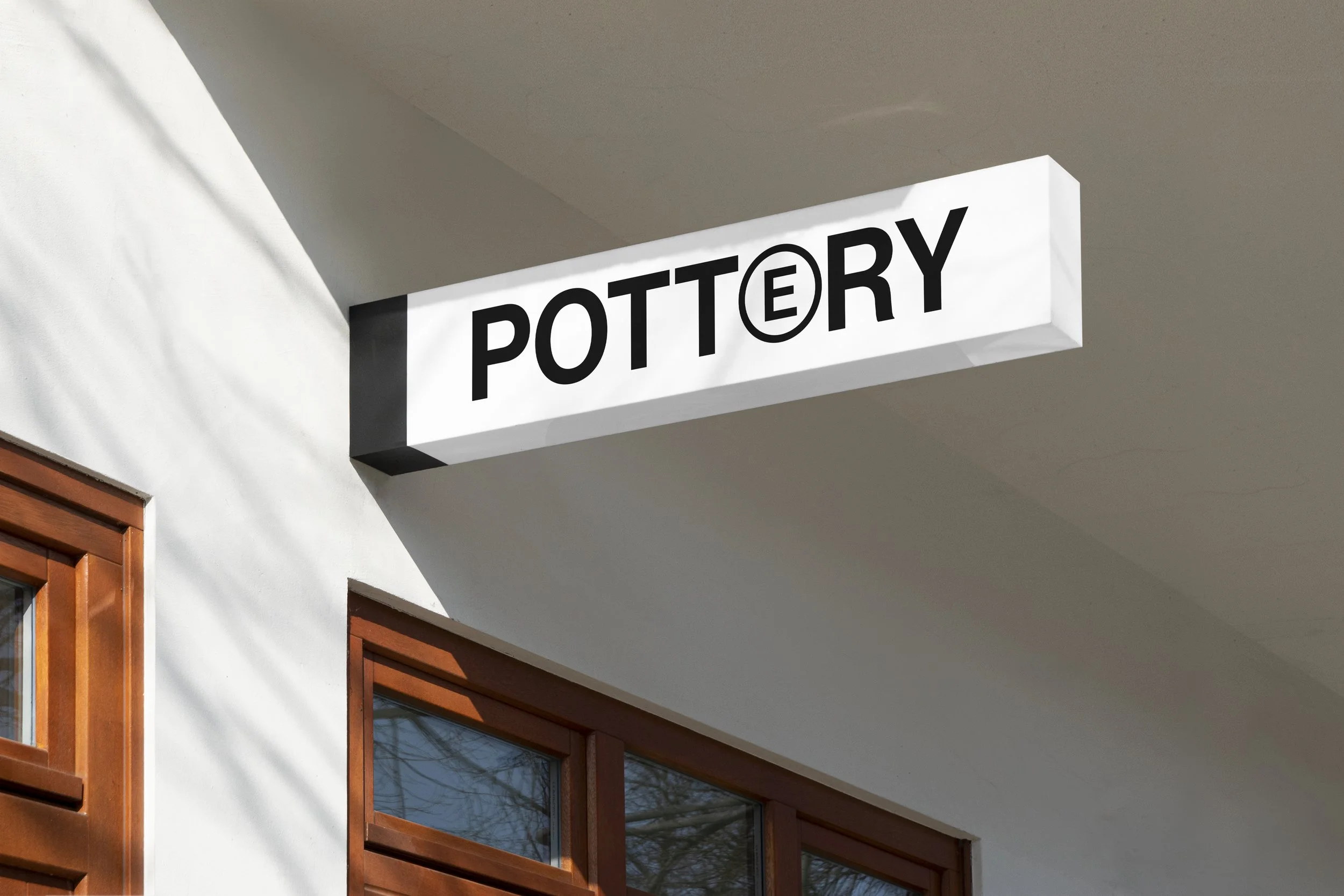
DISTINCTIVE TYPE
One of the more playful aspects of the identity is how we handle type. In select cases, letters from the logo can be pulled into headlines or short phrases to create a distinctive look. This approach adds a layer of visual interest while reinforcing the SPACE identity in a subtle but recognizable way.


THE OUTCOME
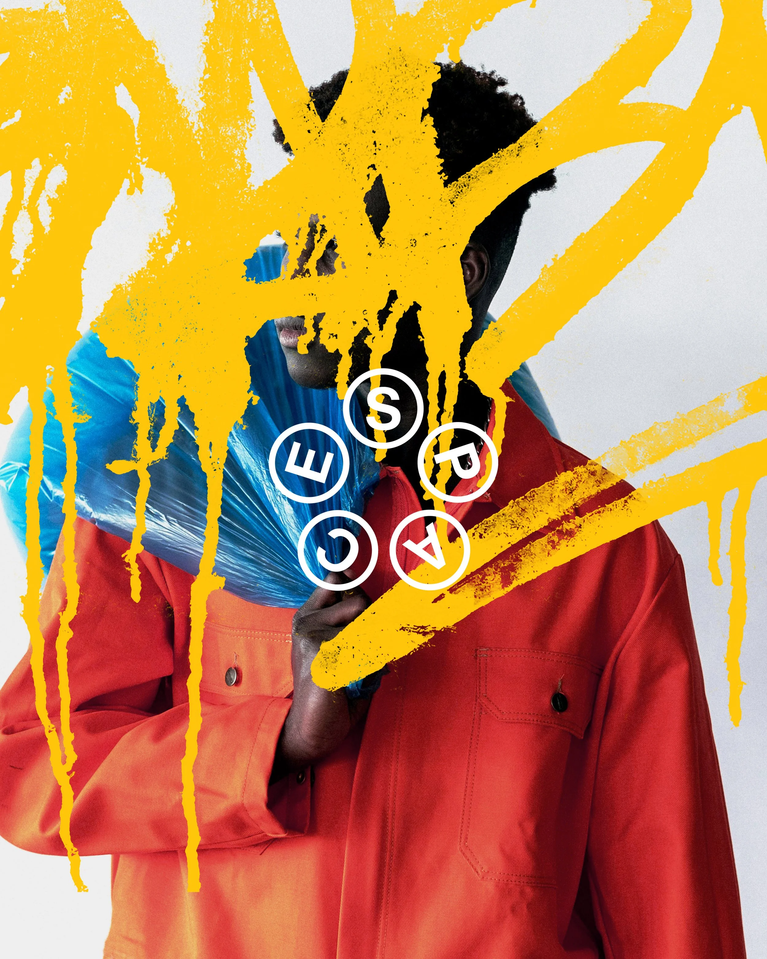
A lot of people have ideas—but not everyone sees them through. This project is what happens when you do. It’s the result of committing to an idea, exploring it from every angle, and not being afraid to take creative risks along the way. The final identity for SPACE blends two drastically different aesthetics into something that feels cohesive, expressive, and full of intention. It doesn’t just look intriguing—it reflects the values, spirit, and ambition of the brand at its core. That’s the power of following an idea all the way through. That’s what this project represents.

Sara Jones - Executive Director, SPACE
“Working with Austin on the SPACE identity was an awesome experience. He listened to every vibe I wanted to represent and guided me through moments when I struggled to find the right words to explain what I was looking for. He offered insights I wouldn’t have thought of on my own, and his design instincts consistently elevated my ideas.
The typography he landed on was different than what I had originally imagined, but I quickly realized it was infinitely better. As someone raised by a graphic designer and who has spent much of my life being staunchly anti-aesthetic, I was really impressed with how Austin honored that perspective and transformed it into a brand identity that feels genuine. He responded quickly and gracefully to feedback and never made me feel like adjustments were a burden.
He went above and beyond in his services, offering explanations and critiques without ever making me feel inexperienced for asking. His style is instantly recognizable, which is why I sought him out, but what impressed me most was that the final product feels like true SPACE branding, not just “an Austin design.”

CMMA Visual Identity
Visual Identity, Logo

Vans Better With Wear Campaign
Advertising/Marketing Campaign

Collect & Contrast Visual Identity
Visual Identity, Logo
